
HMI & UX Design for MAN TGX
Truck & Bus Platform
Digital Cluster · Infotainment · Sleeper Control
Consulting and hands-on UX design for the first fully digital cockpit generation at MAN Truck & Bus. Focus on safety-critical HMI, system consistency, and series-ready solutions under regulatory constraints.
When MAN Truck & Bus began replacing the analogue instruments of the TGX series with digital systems after nearly 20 years, the company was entering largely uncharted territory. Digital displays, driver assistance features, and new interaction concepts had to function reliably under real driving conditions — at speed, under stress, and with high responsibility.
Since 2017, I have been part of this transformation as a UX Design Consultant. Working closely with internal teams, engineering, and external suppliers, I developed, evaluated, and supported HMI concepts through to series production — with the goal of making complex systems clear, understandable, and safe to use for drivers.
What I Designed in Practice
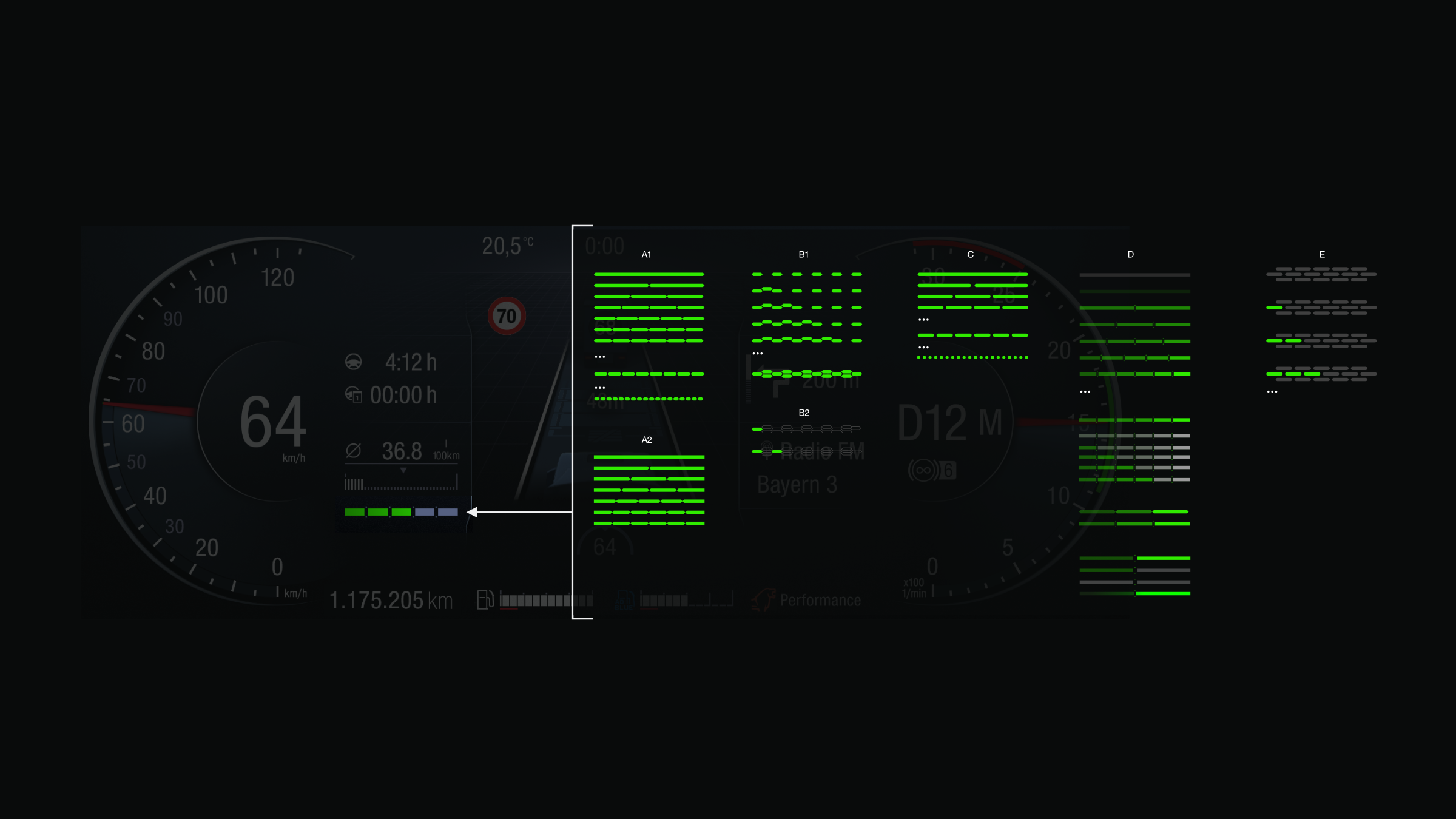
A core focus of my work was interaction logic and information prioritization across multiple domains, including navigation, telephony, menu structures, and vehicle-specific functions. In systems like these, visual polish alone is meaningless if system states are not clearly readable. Good UX in this context means delivering the right information at the right moment — and always in a way that allows the driver to immediately understand whether a state is normal, critical, blocked, or optional.
A second major theme was consistency across multiple surfaces. A truck does not have a single UI. It consists of an instrument cluster, infotainment system, control units, sometimes different display types, and a variety of usage contexts (driving, maneuvering, resting, sleeper mode). A key part of my role was therefore to define interaction patterns that remain recognizable across all modules, so drivers do not have to relearn the system each time they switch contexts.
From early 2020 onward, my focus increasingly shifted toward bus-specific GUI topics, systematically transferring insights and patterns developed in the truck environment. The underlying principle remained the same: robust interaction, clearly distinguishable system states, and minimal cognitive load.
A Representative Example: “Eco” Display / Concept Decision
There were situations in which multiple design variants were evaluated over several weeks, yet none of them addressed the core problem effectively. A typical example was the eco/efficiency display. Supplier-provided concepts formally “worked,” but failed in practice — either because they were too technical, insufficiently prioritized, or visually unstable under real driving conditions.
In such cases, I did not iterate endlessly on feedback. Instead, I created a counter-proposal: within a few hours, a concept that clarified the underlying logic, separated system states cleanly, and remained visually calm enough to be viable in a driving context. This ability — making fast, clear decisions under real constraints — is critical in series production projects. (This concept is in use in production trucks today.)
Icon System: Scale, Standards, and Governance
A long-term central responsibility was the development of a system-wide icon style guide. Over several years, several thousand icons were created for both hardware and software. In the automotive and commercial vehicle domain, this is not an illustration exercise, but a highly regulated, tightly coordinated system.
The process does not start with drawing, but with logic: Which states exist according to state charts? Which functions actually require an icon? Which symbols are standardized? Which metaphors are permissible, understandable, and internationally readable? On top of that come technical constraints such as display resolutions, contrast requirements, manufacturing processes (e.g. laser engraving, printing), and internal corporate guidelines.
My contribution was primarily to translate this “rule landscape” into a consistent, scalable design logic — a visual system that works across different applications, remains reproducible, and does not break down when handed over to suppliers. In parallel, groundwork was laid for integrating the icon set into a content/asset management system to enable company-wide access and reuse.
Outcome: Why This Matters Beyond Automotive
This project represents a type of UX that is relevant across many industries: complex systems, real-time decision-making, safety-critical contexts, hardware-software integration, and supplier-driven development environments. The output is not just screens, but decision-ready concepts, clear interaction models, and design solutions that remain stable under real-world conditions.
When I speak about “system UX” today, this is what I mean: interfaces that build trust by making system states visible, guiding actions safely, and structuring complexity so it remains manageable.
Summary (Supporting, Not Leading)
Role (one sentence): UX design consulting and implementation for series-ready HMI systems within complex supplier and engineering ecosystems.
Focus: Information prioritization, state logic, cross-module consistency, and implementation-grade design quality.
Deliverables: Concepts, interaction flows, UI designs, guidelines, quality assurance, and stakeholder alignment.